The top STUCO posters of 2021
February 10, 2021
Every February, the walls of LHS become covered top to bottom in posters almost overnight, as the Student Council election season begins. This year, STUCO candidates were allowed to hang up their posters the morning of Feb. 4. Unlike past years, they were limited in the amount of posters they could hang, as there are only four hallway locations designated for them: the band hallway, across from administration, outside the little theatre and in the glass staircase. However, even with these new restrictions, LHS students did not disappoint in the creativity and craftsmanship displayed in their campaign posters. There are, of course, a few standout posters, which I, being a senior and therefore unable to vote in this year’s STUCO elections, have decided to rank. I am not endorsing any of these STUCO candidates, of course, but rather commending them on their success in creating memorable posters.
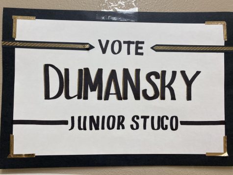
- Junior Hannah Dumansky- I really enjoyed the aesthetic appeal of this poster. With a color scheme of black, white and gold, it fits very well with my own preferred color palette. The wording is straight and to the point, and relies solely on name recognition. This strategy is respectable; Dumansky knows people are aware of who she is, and she isn’t going to waste anyone’s time with a punny slogan.
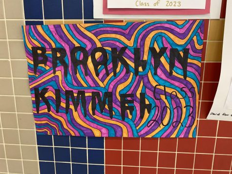
- Sophomore Brooklyn Kimmel- Similar to the previous one, this poster does not have any catchphrases to distract from the candidate’s name, which has a very impressive font considering it was hand-drawn. What makes this poster so eye-catching is the overly colorful, optical-illusion-esque background. The process of coloring this entire sheet of paper must have been very labor-intensive, and I admire Kimmel’s efforts and commitment to the art of the poster.
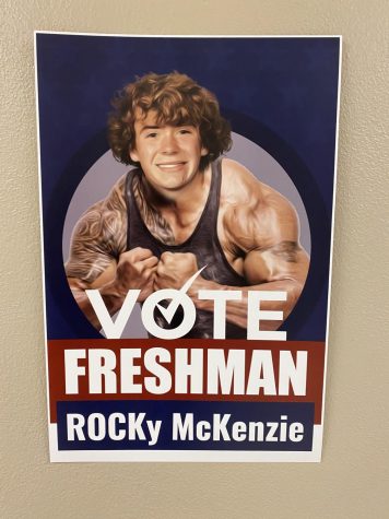
- Freshman Rocky Mckenzie- I would say that this poster does look the most professional out of the bunch, due to the fact that it is not hand-drawn. It clearly took strong photoshop skills to accomplish this rather frightening depiction of a freshman, and the image will certainly be memorable in the minds of students. Of course, there is also a pun included in this poster, which is almost a requirement at this point. Overall, I am impressed with the cohesivity and execution of this poster.
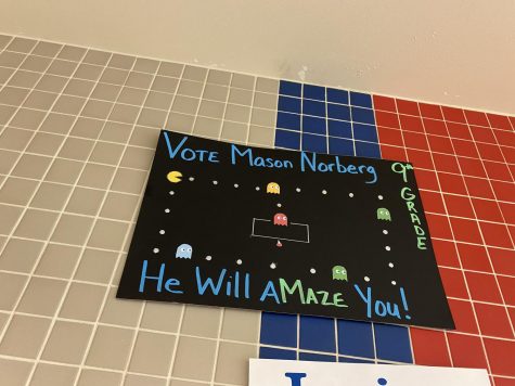
- Freshman Mason Norberg- First off, I have to admit I am a sucker for black poster paper, as I believe it adds elements of sophistication and edge. The pop of the neon letters in contrast to a dark background makes this poster stand out from the rest, as do the perfectly drawn Pac-man characters. Although the pun could be labeled as cheesy, it is clever how Norberg replicated the image of a classic game and connected it to a short and sweet catchphrase.
Although a candidate’s poster isn’t the only thing students should keep in mind when deciding who to vote for as their class’s student council representatives, let’s be real, it’s a lot easier to rank people based on a single poster than on their overall merit or leadership potential.